Colour: Build a Working Palette
Coordinate base coats, secondary panels, and fine-line accents with engine cases, exhaust headers, and outdoor lighting.
The 70–20–10 Proportion Rule on Two Wheels
Unlike a car body, a motorcycle presents small, interrupted paint surfaces separated by dark mechanical voids. When two colours occupy an equal 50/50 split on a fuel tank, neither shade claims ownership of the silhouette, and the bike can look shorter than it really is. Applying a 70% dominant spine colour, a 20% secondary flank or scallop colour, and a 10% high-contrast pinstripe or badge colour creates hierarchy from twenty paces away while rewarding close inspection.
Emerald & Copper Leaf
70% Metallic Racing Green, 20% Deep Forest Pine, 10% Brushed Copper coachline. Ideal alongside polished alloy cases.
Oxblood & Signal Amber
70% Deep Oxblood Maroon, 20% Vermilion Knee Insert, 10% Warm Gold hairline. Pairs cleanly with blacked-out engines.
Desert Ochre & Basalt
70% Warm Terracotta Ochre, 20% Satin Basalt Black, 10% Chalk Cream number outline. Built for scramblers and trackers.
Plum Velvet & Acid Lime
70% Deep Aubergine Pearl, 20% Radiant Violet block, 10% Chartreuse keyline. High-visibility streetfighter contrast.
Why Flat Swatch Cards Lie (And How to Test Properly)
Choosing motorcycle paint from a postage-stamp paper chip under fluorescent shop lights is the fastest way to end up with a colour that looks muddy on the road. Because a motorcycle tank is tightly radiused, the top crown reflects the bright sky while the lower knee tuck faces dark asphalt—creating a dramatic value shift called flop in pearls and metallics.
The Curved Speed-Shape Test
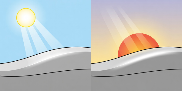
Before buying full litres of basecoat, spray or wrap curved plastic "speed-shapes" (or a spare scrap mudguard) with your exact primer shade, basecoat, and pinstripe colour. Tape the sample directly onto your motorcycle's tank and inspect it in three lighting conditions: bright midday sun, overcast shade, and warm evening streetlamp light.
"Dark colours shrink a bulky touring tank; high-value warm creams and metallics expand a narrow vintage peanut tank. Use value contrast to tune the perceived mass of the bike." — Fieldnote on Value & Mass
Bridging Clashing Undertones with a Keyline
If your dominant colour is cool-toned (such as deep pine green) and your secondary panel is warm-toned (such as desert sand or bronze), placing them edge-to-edge can make the seam look murky. Running a 2 mm to 3 mm neutral or metallic bridge stripe—such as warm charcoal, pale ivory, or copper leaf—cleanly separates the two colour temperatures so both pigments read at full saturation.
Once your palette is locked, move to Protect the Final Layer to decide how gloss, satin, or matte clearcoats will shape your palette's final reflection.